Download Microsoft.70-357.CertKey.2019-07-31.30q.tqb
| Vendor: | Microsoft |
| Exam Code: | 70-357 |
| Exam Name: | Developing Mobile Apps |
| Date: | Jul 31, 2019 |
| File Size: | 4 MB |
Demo Questions
Question 1
Note: This question is part of a series of questions that present the same scenario. Each question in the series contains a unique solution. Determine whether the solution meets the stated goals.
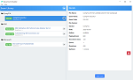
You need to implement the appropriate XAML layout for the Timeline app.
Solution: You create an instance of a StackPanel class.
Does this meet the goal?
- Yes
- No
Correct answer: B
Explanation:
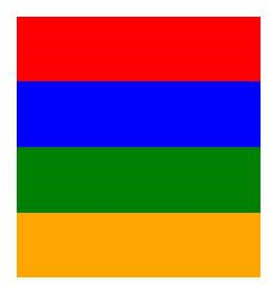
StackPanel is a simple layout panel that arranges its child elements into a single line that can be oriented horizontally or vertically. StackPanel controls are typically used in scenarios where you want to arrange a small subsection of the UI on your page. The following XAML shows how to create a vertical StackPanel of items. XAML <StackPanel> <Rectangle Fill="Red" Height="44"/> <Rectangle Fill="Blue" Height="44"/> <Rectangle Fill="Green" Height="44"/> <Rectangle Fill="Orange" Height="44"/> </StackPanel> The result looks like this. Reference: https://docs.microsoft.com/en-us/windows/uwp/layout/layout-panels StackPanel is a simple layout panel that arranges its child elements into a single line that can be oriented horizontally or vertically. StackPanel controls are typically used in scenarios where you want to arrange a small subsection of the UI on your page.
The following XAML shows how to create a vertical StackPanel of items.
XAML
<StackPanel>
<Rectangle Fill="Red" Height="44"/>
<Rectangle Fill="Blue" Height="44"/>
<Rectangle Fill="Green" Height="44"/>
<Rectangle Fill="Orange" Height="44"/>
</StackPanel>
The result looks like this.
Reference: https://docs.microsoft.com/en-us/windows/uwp/layout/layout-panels
Question 2
Note: This question is part of a series of questions that present the same scenario. Each question in the series contains a unique solution. Determine whether the solution meets the stated goals.
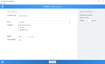
You need to implement the appropriate XAML layout for the Timeline app.
Solution: You create an instance of a RelativePanel class.
Does this meet the goal?
- Yes
- No
Correct answer: A
Explanation:
RelativePanel lets you layout UI elements by specifying where they go in relation to other elements and in relation to the panel. By default, an element is positioned in the upper left corner of the panel. Reference: https://docs.microsoft.com/en-us/windows/uwp/layout/layout-panels RelativePanel lets you layout UI elements by specifying where they go in relation to other elements and in relation to the panel. By default, an element is positioned in the upper left corner of the panel.
Reference: https://docs.microsoft.com/en-us/windows/uwp/layout/layout-panels
Question 3
Note: This question is part of a series of questions that present the same scenario. Each question in the series contains a unique solution. Determine whether the solution meets the stated goals.
You need to implement the appropriate XAML layout for the Timeline app.
Solution: You create an instance of a SplitView control.
Does this meet the goal?
- Yes
- No
Correct answer: B
Explanation:
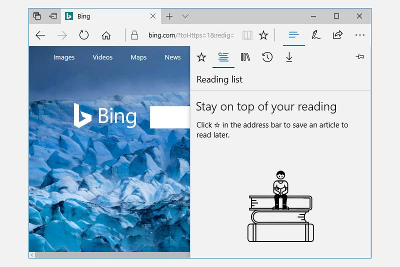
A split view control has an expandable/collapsible pane and a content area. Here is an example of the Microsoft Edge app using SplitView to show its Hub. Reference: https://docs.microsoft.com/en-us/windows/uwp/controls-and-patterns/split-view A split view control has an expandable/collapsible pane and a content area.
Here is an example of the Microsoft Edge app using SplitView to show its Hub.
Reference: https://docs.microsoft.com/en-us/windows/uwp/controls-and-patterns/split-view