Download IBM.C1000-018.VCEplus.2022-01-06.60q.tqb
| Vendor: | IBM |
| Exam Code: | C1000-018 |
| Exam Name: | IBM Security QRadar SIEM V7-3-2 Fundamental Administration |
| Date: | Jan 06, 2022 |
| File Size: | 499 KB |
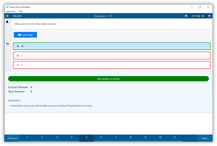
Demo Questions
Question 1
Which use case type is appropriate for VPN log sources?(Choose two.)
- Advanced Persistent Threat (APT)
- Insider Threat
- Critical Data Protection
- Securing the Cloud
Correct answer: AB
Explanation:
Reference: https://www.ibm.com/docs/en/dsm?topic=management-threat-use-cases-by-log-source-type Reference: https://www.ibm.com/docs/en/dsm?topic=management-threat-use-cases-by-log-source-type
Question 2
What is displayed in the status bar of the Log Activity tab when streaming events?
- Average number of results that are received per second.
- Average number of results that are received per minute.
- Accumulated number of results that are received per second.
- Accumulated number of results that are received per minute.
Correct answer: A
Explanation:
Status bar When streaming events, the status bar displays the average number of results that are received per second. Reference: https://www.ibm.com/docs/en/qradar-on-cloud?topic=investigation-log-activity-tab-overview Status bar
When streaming events, the status bar displays the average number of results that are received per second.
Reference: https://www.ibm.com/docs/en/qradar-on-cloud?topic=investigation-log-activity-tab-overview
Question 3
An analyst wants to analyze the long-term trending of data from a search.
Which chart would be used to display this data on a dashboard?
- Bar Graph
- Time Series chart
- Pie Chart
- Scatter Chart
Correct answer: A
Explanation:
You could use a bar graph if you want to track change over time as long as the changes are significant. Reference: https://www.statisticshowto.com/probability-and-statistics/descriptive-statistics/bar-chart-bar-graph-examples/ You could use a bar graph if you want to track change over time as long as the changes are significant.
Reference: https://www.statisticshowto.com/probability-and-statistics/descriptive-statistics/bar-chart-bar-graph-examples/